How a simple Adif QR code sparked it all (and how I built my own configurator)
What began by scanning a simple station QR turned into building a visual configurator for real-time train panels. A mix of reverse engineering, hidden parameters, and modern frontend to reimagine a semi-closed public system.
It all started with a random click: I was scrolling through Twitter when I saw a station QR code claiming to show live train schedules. Out of curiosity, I scanned it… and that led me down a fascinating rabbit hole of reverse engineering, hidden parameters, and custom-built dashboards. Long story short: I ended up creating my own visual panel configurator.
Let’s break it down.
Adif, Trains, and a QR Code That Opened More Than Expected
First, some context: Adif (Administrador de Infraestructuras Ferroviarias) is the public company that manages much of Spain’s railway network. It also handles many stations and some of the passenger information systems—like those big screens showing arrivals and departures.
The URL behind the QR code looked like this:
https://info.adif.es/?s=18000
The s=18000 part clearly referred to the station (each one has a public ID). So far, nothing unusual. But after inspecting the source code, I realized the website was actually a simple Angular app loading an iframe where all the real content lived. And that iframe… was the real jackpot.
Unlocking Hidden Features by Tweaking the URL
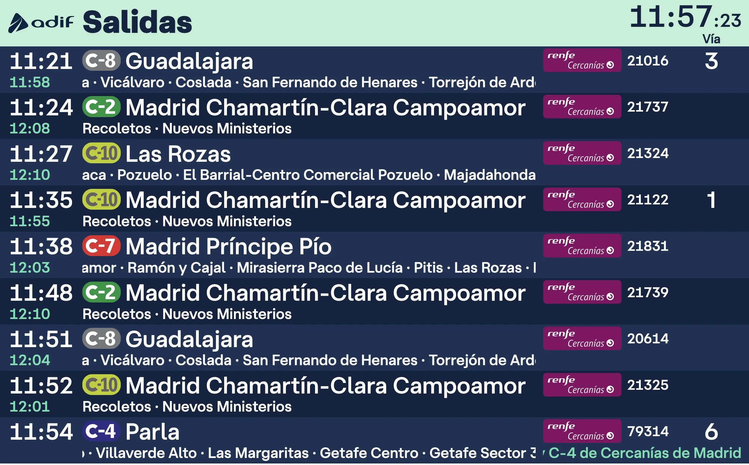
The iframe accepted its own URL parameters—and the outer wrapper passed most of them through almost untouched. By playing with the URL, I discovered flags to switch views (arrivals, departures, specific platforms…), adjust columns, filter services… tons of features that weren’t visible to regular users.
Some parameters—like those filtering by train type (local, high-speed, etc.)—were hardcoded in the wrapper and couldn’t be changed directly. But even that wasn’t a dead end.
The Bug: Using # and Ninja Parameters
The key was noticing that the wrapper didn’t validate parameters before passing them to the iframe. By adding something like a¶m1=value1¶m2=value2#, the # would truncate the rest of the URL before the wrapper could inject its defaults, letting your custom parameters take control.
A real-world example of how poor parameter handling can open up a semi-closed system to full customization.
From Hack to Tool: Building a Visual Configurator
Once I realized I wasn’t the only one experimenting (discussions were popping up in forums and Telegram groups), I decided to make life easier for others and built a visual interface that generates the custom URL without needing to dig into the code.
I built the app using React, TailwindCSS, and Shadcn components—no time wasted on UI boilerplate. At first, it only generated the URL. Then I took it further: I copied Adif’s original app (HTML, CSS, and unminified JS) and hosted it as a static asset on my site, letting me fully control the design and behavior.
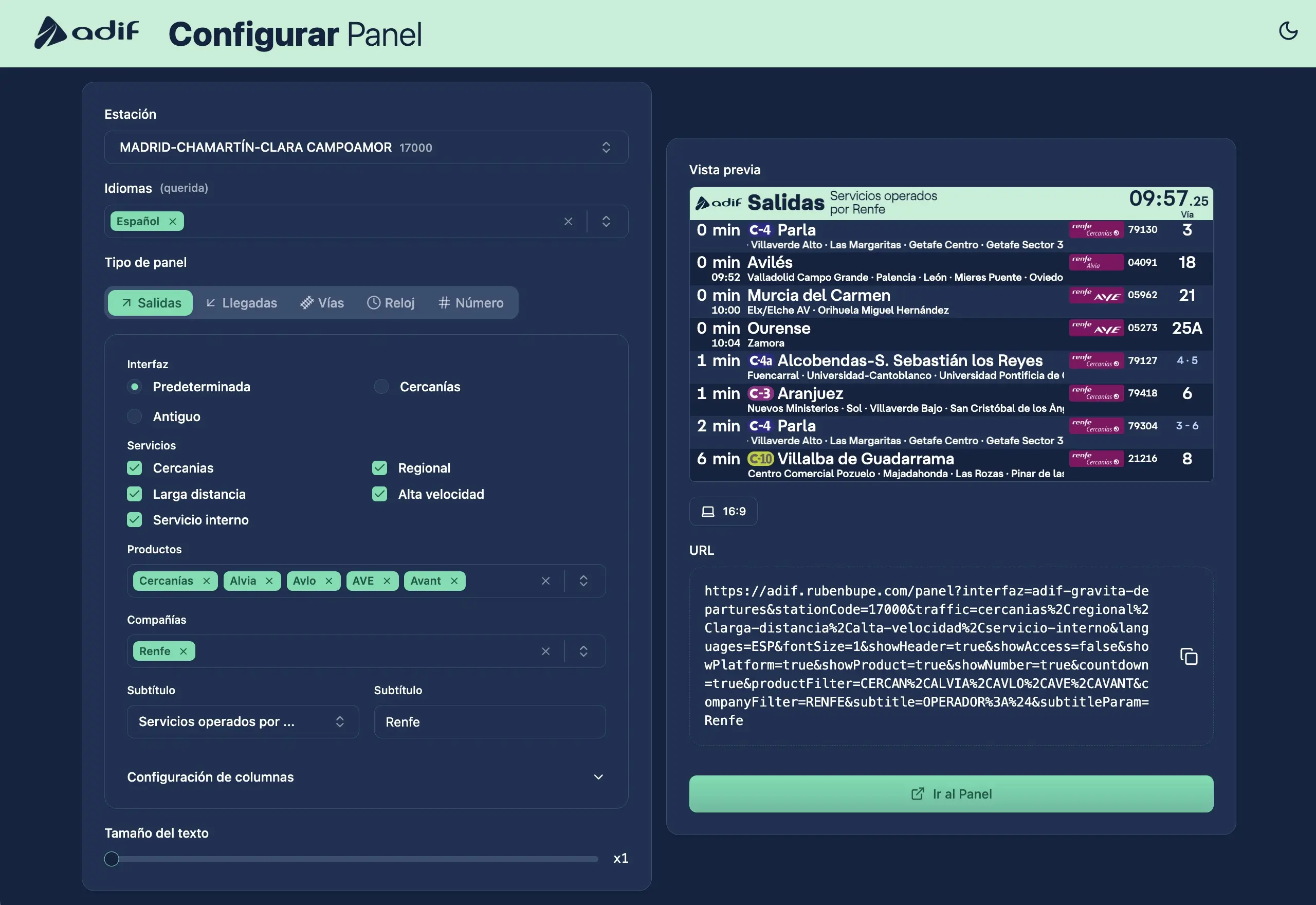
Choosing a Station Without Dy ing
I didn’t want anyone to have to manually look up station codes, so I automated it: I found a public Renfe API with up-to-date station data, pulled the results, filtered them, and built a clean and intuitive selector into the form.
Rebuilding the System from Scratch
Digging into how the original system worked was incredibly fun. I reverse engineered how the wrapper built and forced certain parameters, how the data was structured, and exactly what the iframe expected. That let me design a configurator that exposed every available option, even the undocumented ones.
But I didn’t stop there. I wrote my own wrapper in React, connected directly to the WebSocket the Adif app used, and dropped the iframe altogether. I replaced it with a fully editable local version and designed custom interfaces with my own styles.
And yes—the original app was written in jQuery, generating HTML through JavaScript like it was still 2011. Classic.
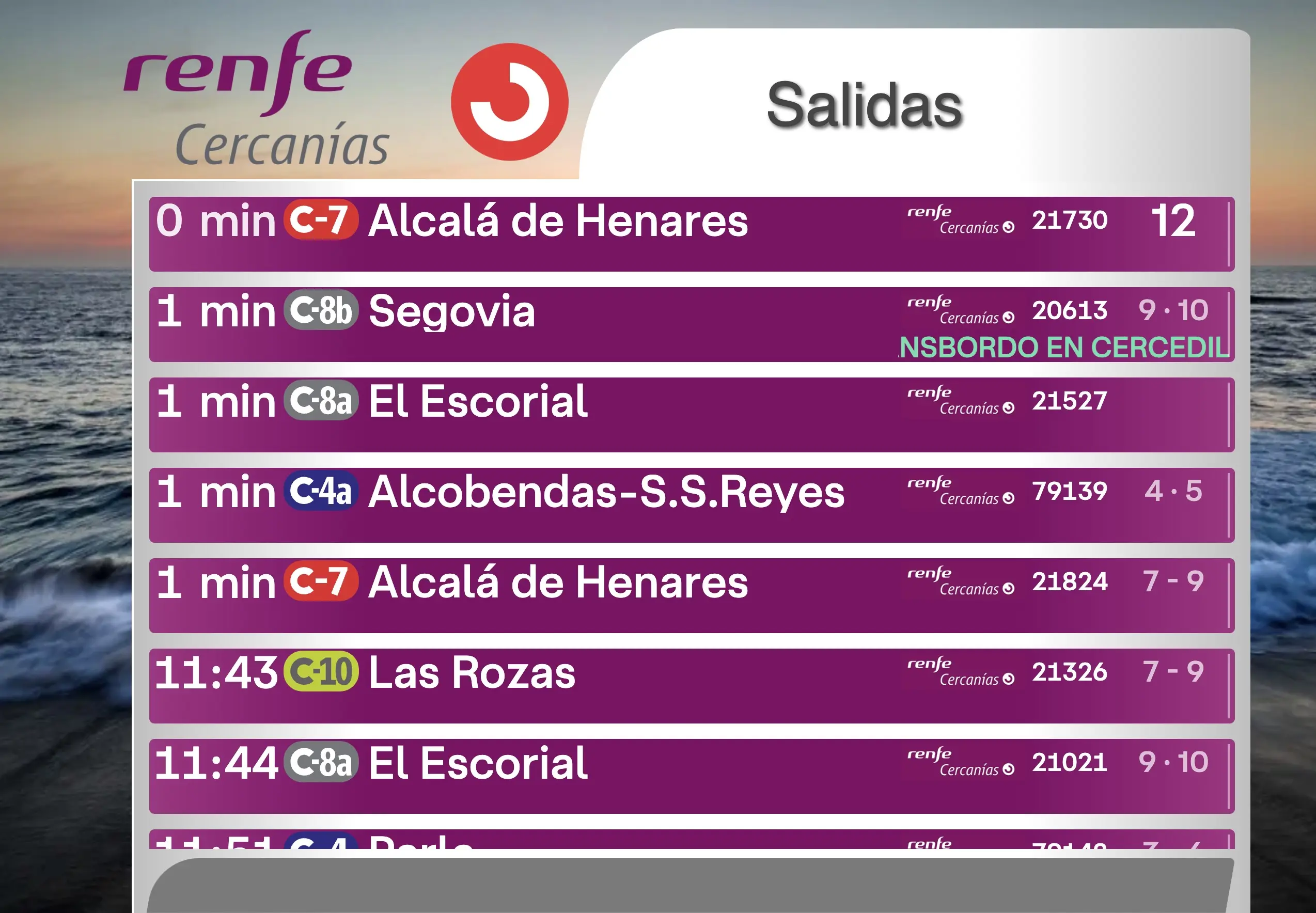
Recreating the Original Look with Care
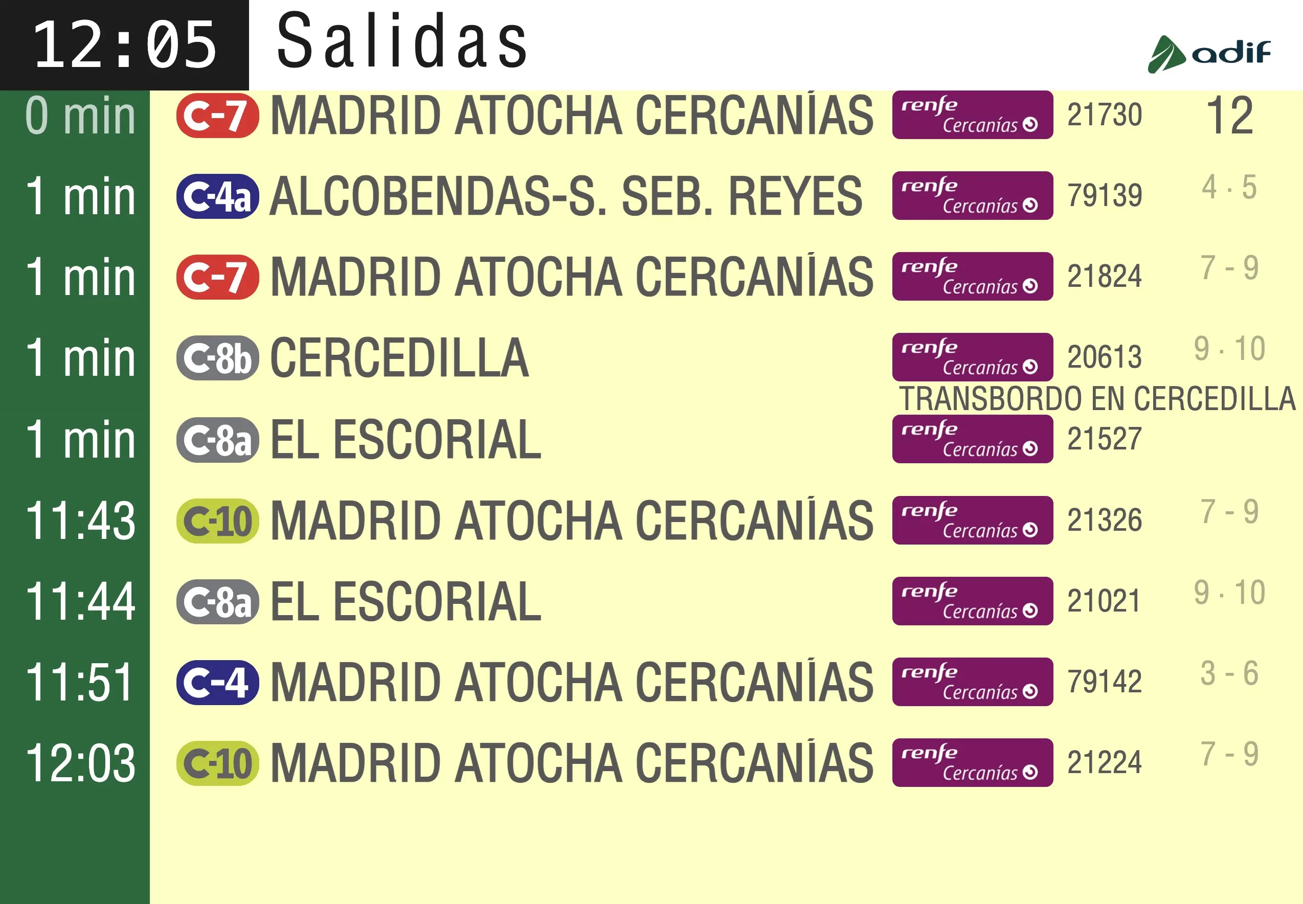
One of my goals was to replicate the nostalgic look of the classic railway panels:
- Renfe Cercanías: scenic backgrounds, purple-striped tables, blurry logos and text—a retro-futuristic vibe.
- Classic Adif: bright yellow tables, white headers, green Adif details. Pure vintage.
I didn’t use any third-party libraries here. Just reference images and handcrafted CSS to capture the style as accurately as possible.
| Cercanías panel | Old Adif panel |
|---|---|
 |  |
The fun’s over
The app works through a clean form: choose your settings, get your custom panel URL, and share it. Everything runs client-side, fully static and open source. The code is well-commented where things get tricky, so anyone can understand it, fix bugs, or add new features.
Building the app and form was easy. The real challenge was deciphering the original logic, identifying key parameters, and outsmarting the wrapper to make everything configurable. Now it just needs occasional tweaks and light maintenance.
A Thought: What If Public Platforms Really Opened Up?
This project shows what communities can achieve when public data is actually accessible. Others have created similar tools. The range of ideas proves that if Adif and similar public entities offered well-documented open APIs, innovation and user benefit would skyrocket.
If the data were truly open, the rail ecosystem would be far more powerful—for everyone.
Want to Try It?
Check out the code, clone it, adapt it, or just explore how it works. Everything’s available on my GitHub. Got ideas, improvements, or stories to share? I’d love to hear them.
🔗 Original tweet: https://x.com/rubenbupe/status/1943004611574665501